CS 6630 Scientific Visualization - Project 2
Zach Gildersleeve
Oct. 17, 2006
CADE login: gildersl
Graduate level credit
Part A and B - Univariate Colormaps
Scripts Used: "writepoints.tcl", "uniColor.tcl"
Files Produced: "points.vtk", images
The script uniColor.tcl generates a GUI in which the user can dynamically manipulate the start and end point of a univariate colormap, and apply that map to 2D and 3D versions of three different datasets. With the 2D version, the colormap is applied onto a 2D plane, with color representing different data values, while the 3D version warps the geometry according to the respective data value, and then applies the colormap. Theoretically, looking directly down the 3D data's Y-axis should mirror the 2D version, however we will see that this is not the case, as the extra triangulation and warping steps emphasize elements. In the Mt. Hood dataset, for example, data objects such as ridgelines are visualized much better in the 3D image than in the 2D. The same peaks and valleys are more clear in the 3D version of the thorax data, however this proves to emphasize a fundamental problem with the thorax dataset, which will be discussed below. While the 2D version produces much quicker results, the 2D images are hindered when creating and applying the colormap, in that building a colormap to isolate detail is a less intuitive process. With the added functionality of movement of the 3D object, it is quite straightforward to create and apply a colormap - thus the 3D warped versions of the datasets are superior to the 2D versions for this particular application. The DEM file only fits into the 3D part of the uniColor.tcl pipeline, and will be discussed as a special case.
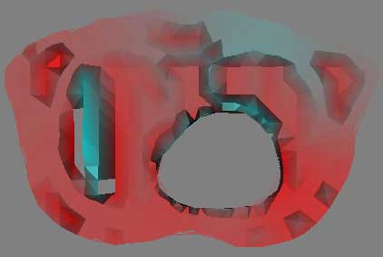
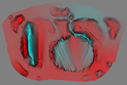
Thorax Data
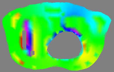
2D thorax image, meaningless rainbow colormap
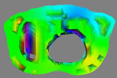
3D thorax image, meaningless rainbow colormap
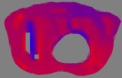
2D thorax image, red to blue
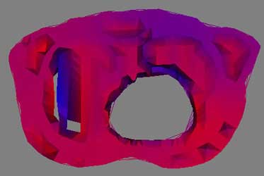
3D thorax image, red to blue
To visualize the thorax data requires first processing and condensing the assignment1.data and assignment1.pts into an appropriate format. This was done by writepoints.tcl in Project 1, and produces a vtkPolyData stored in points.vtk. This dataset is run through a vtkDelaunay2D filter to tessellate the poly data into a viewable image, using the tolerance of 0.001 and an alpha of 18.0 as established in Project 1 as well. Using vtkElevationFilter, high and low points to the data are set. Unfortunatly, the documentation for the vtkElevationFilter's high and low points leaves much to be desired. While it is possible to pull these points directly from the data, as was done with the DEM dataset, here a range of -25, 25 was picked as to provide a good visualization of the negative and positive elements in the dataset. The generated colormap is applied during the vtkDataSetMapper and vtkPolyDataMapper2D steps for 3D and 2D, respectively. The four images above give an example of a poor colormap versus a more intuitive one. The rainbow colormap certainly is colorful, and displays overall areas of high and low data, such as the northern rim of the circular hole. However, the chance of confusion is present, such as the similar appearance of magenta (on one extreme of the dataset) and red (on the other extreme), and without a very detailed description of what data values lookup what colors, the visualization is essentially just a pretty picture. Mapping a red to blue colormap to the data returns more useful results, and here the dataset extrema are managed more thoughtfully.
The overall pipeline is as thus:
assignment1.pts + assignment1.data -> writepoints.tcl -> write - vtkPolyData - read -> vtkDelaunay2D filter -> vtk elevation filter + set low and high points -> vtk mapper (2D & 3D) + SetLookupTable -> vtk actor (2D & 3D) -> vtk renderer
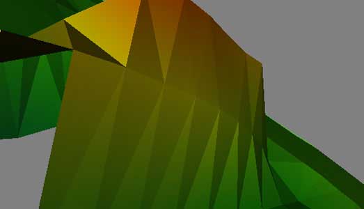
Mount Hood Elevation Dataset
2D Mt Hood image, saturated green to desaturated bright yellow
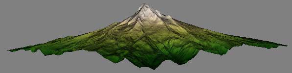
3D Mt Hood image, saturated green to desaturated bright yellow
Here, with the Mt. Hood dataset, the goal with selecting a colormap was one of a realistic selection that would correspond intuitively to the viewer's concept of terrain. With this dataset and colormap in particular, the power of 3D to visualize is evident. The established warp scale of 0.25 was used, and the high and low points for the vtkElevationFilter were set at 0 50, which again was selected to provide the best visualization, and does not correspond directly to data values. However, very quickly, the user is able to discern lower elevation forests transitioning up to a sub alpine environment - a correct visualization of the data. The pipeline is as follows:
grayscale image data -> read - vtkPNMReader -> structured points dataset -> vtkImageMagnitude -> image data to geometry filter -> vtkWarpScalar + scale factor -> geometry + reader merge -> vtk elevation filter + set high and low points -> vtk mapper (2D & 3D) + SetLookupTable -> vtk actor (2D & 3D) -> vtk renderer
DEM file - East Salt Lake City
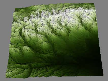
Following the same interests established in Project 1, a DEM file of the Wasatch front was used for the third dataset. Here, the image is available to the user only as a 3D version. Using a similar colormap as the Mt. Hood images, this image is able to quickly visualize the canyons and drainage systems that flow into the Salt Lake basin. Here the high and low points are pulled directly from the data. The pipeline is as follows:
DEM file -> vtkDEMReader -> image data -> vtkImageShrink3D -> image data to geometry filter -> vtkWarpScalar + scale factor -> vtk elevation filter + set high and low points from dataset -> vtkCastToConcrete -> compute normals -> vtk mapper + SetLookupTable -> vtk actor -> vtk renderer
RGB vs. HSV Colormaps in the GUI
The GUI for uniColor.tcl provides a basic means to generate and apply colormaps. The user can select from the three different datasets, and the respective 2D or 3D version of that data, if applicable, using the radiobuttons. An additional radiobutton set activates either the RGB sliders or the HSV sliders. When the RGB sliders are active, the user can select the start and end points of the univariate colormap by manipulating the red, green and blue value between 0 and 255. With the HSV sliders, the user can select a start and end point by setting the hue, saturation, and value between 0.0 and 1.0. For most applications, the HSV sliders provide a more intuitive means to isolate elements, as the human eye responds better to changes in value than changes in hue (as provided in the RGB colorspace). However, creating the red to blue colormap for the thorax data can be done more efficiently with the RGB colorspace rather than the HSV colorspace, as can most simple color A to color B mappings. In the end, the choice of ideal colorspace depends on the data being visualized, the colormap desired, and the desired goal of the visualization.
Part C - Bivariate Colormaps
Scripts Used: "biColor.tcl"
Files Produced: images
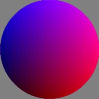
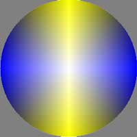
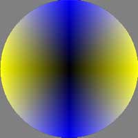
The biColor.tcl script creates a multivariate colormap, and applies that lookup table to a collection of structured point datasets. A discussed in the assignment specifications, there is no direct support in VTK for a bivariate colormap, to the extent that a univariate colormap is readily available. However, it is possible to create a bivariate dataset by requiring VTK to interpret a 2D (16-bit) image as a 2D (8-bit, 8-bit) image, thus creating a two-valued vector. The colormap can then be created, using the same RGB workflow as with the univariate colormaps, but creating a lookup table of size (2^bits)*(2^bits), where bits is the size of each component in the multivariate point. Thus, this workflow will work for any number of data dimensions, provided that the data is encoded accordingly. The lookup map is created through two nested for loops, rather than the single one for a univariate colormap, effectively creating a 2D array of color values. The lookup table can be manipulated to generate a radially asymmetrical colormap, such as Blue -> White -> Yellow -> Black -> Blue (BWYK) around the outside of the provided colormap disc image, or one of radially symmetry, such as Yellow -> Black -> Blue -> Black -> Yellow -> Black -> Blue -> Black -> Yellow around a center of White (BiW). These two colormaps styles lead to different visualizations, as we shall see.
The workflow for this set of images is as follows:
vtkLookupTable create colormap -> vtkStructuredPointsReader -> vtkImageMapToColors + add LUT -> vtkImageActor -> vtk renderer
A simple GUI is provided to switch between image datasets, while the actual colormap must be changed in the code by commenting out sections. After experimenting with different colormaps, the discussion will continue with the following four:
BWYK |
BMRK |
BiW |
BiK |
Mount Hood Elevation Dataset
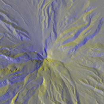
BWYK |
BMRK |
BiW |
BiK |
With the same Mt. Hood elevation dataset, formatted for the above workflow, the radially asymmetrical colormaps provide a more clear visualization. There is essentially no different other than color between BWYK and BMRK, although the yellow in the BWYK image does pull out a little more of the subtle variation in the terrain. The BiW radially symmetrical colormap here is overly confusing and unnecessary, essentially coloring north, south, east, and west facing slopes differently, rather than the north-south different in the asymmetric colormaps. The BiK colormap suffers from the same problems, but it is interesting to see how the ridge and channel lines are visualized as black lines (for example, the upper center), which could be useful for cartographical or route-finding purposes. Overall, the BWYK is perhaps the best colormap of the four for this data.
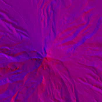
Brain MRI Data - Axial Slice - Not Radially Symmetrical
BWYK |
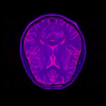
BMRK |
BiW |
BiK |
I have substantially less experience interpreting MRI brain scans then I have interpreting topographical images, so with these images it is more difficult to determine what detail is important to the visualization, and thus necessary to focus on, and what is unnecessary. Here, all four images have been placed against a black background to aid in comparison. There is little difference between the BWYK and BMRK colormaps, except again the yellow brings out detail that gets lost in the blue-magenta-red range. For this reason, it becomes obvious that the BWYK colormap is superior to the BMRK for most visualizations. The BiW colormap applied to this dataset looks shiny and interesting, but overall adds nothing. In fact, the BiW colormap, which outlines in white much the way that BiK outlines in black, tends to blur regions of interest together because of this outlining. This is probably undesired. The BiK, due to the colors, does not seem to suffer as much from this problem, and retains the visual appearance of outlining in black, which may be helpful. It would be interesting to see if either the BiW or BiK contributed to the real-time, animated nature of fMRI. Still, the BWYK provides the most straightforward visualization, but BiK offers some unique insights.
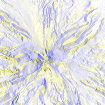
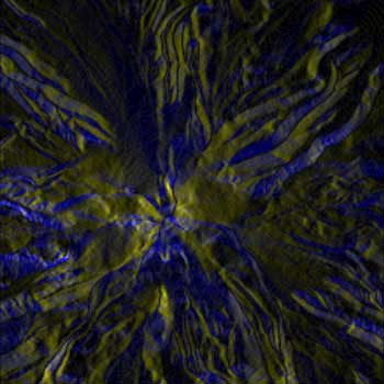
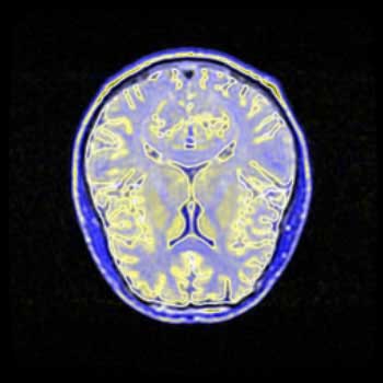
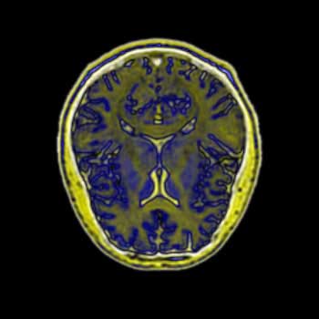
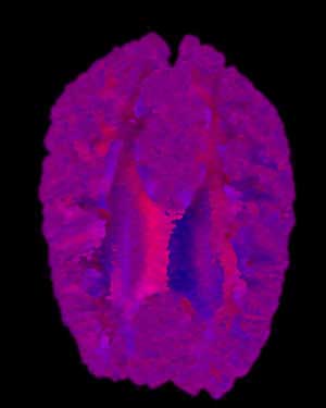
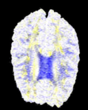
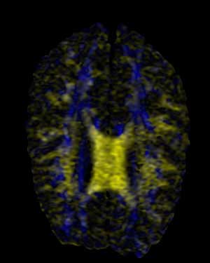
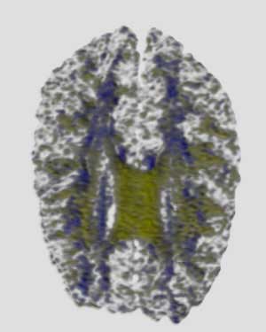
Brain MRI Data - Axial Slice - Radially Symmetrical
BWYK |
BMRK |
BiW |
BiK |
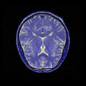
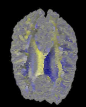
Here we are presented with a DT-MRI scan that helps to visualize the structural organization of the brain. All four images have been place against a black background to aid in comparison. As noted in the assignment, the vector information in this dataset represents an eigenvector, that is, a vector that is unchanged by its own transformation. Therefore, the radially symmetrical colormaps will be superior here, as can be quickly noted by looking at the visualization. Vector v should be the same color as -v given that v is an eigenvector, which it is clearly not in the BWYK and BMRK colormaps (note the split between brain hemispheres). However, with the radially symmetrical colormaps, and particular the BiK colormap in particular, a decent visualization is generated that illustrates brain structure via white matter. The BiW and BiK are hampered by the colored backgrounds that bleed through the visualization, but this could be corrected for by additional post-processing, to create images that show a fair amount of the brain structure, as seen below. Of course, these could just be pretty images.
|
|
Additional Questions
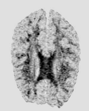
What is visually wrong with the color map of the thorax data? What is causing this?
A fundamental problem with the thorax data is the low number of samples in the dataset. Due to the method by which color is assigned to vertices via a lookup table, and then interpolated across a face, a low sampling can produce visible lines separating the different poly faces. This produces "shark teeth," where neighboring triangles appear to alternate shading, as the steps between each vertex is too great to produce an overall smoothly shaded object across multiple triangles. There are multiple means to correct this, the ideal solution being to simply sample more points. However, as this is unavailable, it should be possible to subdivide the data, creating midpoints that should alleviate the problem. A higher order interpolation of the colormap lookup values might also reduce the stepping across triangles.
Upon examination of the VTK modules, there are several methods that might provide this functionality, including vtkLinearSubdivisionFilter, vtkButterflySubdivisionFilter, and vtkSmoothPolyDataFilter. The smooth filter does accomplish what we want, but at the expense of sever reduction in quality and shape. The linear subdivision filter takes too long for not the necessary results, while the butterfly filter produces a nice image fairly quickly, which is shown for comparison with the unfiltered image below. It is necessary to set the delaunay alpha to 0.0 to accurately subdivide the data.
Unfiltered Image
5x Butterfly Subdivision Filter